Creating Visual Harmony with Tile and Grout Colour Combinations
Tiles are more than just functional elements; they are design statements that can transform spaces. Whether you’re renovating your kitchen, bathroom, or any other area in your home or business, the colour combinations you choose for your tiles and grout play a crucial role in creating visual harmony. This blog explores the art of combining tile and grout colours to enhance aesthetics, elevate design, and achieve a cohesive look in your living or working space.
The Impact of Colour in Design
Before delving into the specifics of tile and grout colour combinations, let’s understand the impact of colour on design. Colours evoke emotions, set moods, and influence perceptions. The right colour scheme can make a room feel cosy, spacious, vibrant, or serene. In contrast, a mismatched or clashing colour combination may disrupt the visual flow and create a sense of discord.
In the realm of tiles and grout, colour choices go beyond mere aesthetics. They contribute to the overall ambiance, influence the perceived size of a space, and define the style of a room. Whether you’re aiming for a contemporary, classic, rustic, or eclectic look, your choice of tile and grout colours plays a pivotal role in achieving your desired design outcome.
The Basics of Tile and Grout Colour Selection
- Consider the Room’s Purpose
The function of the room should guide your colour choices. For example, soothing and neutral tones might be ideal for a bathroom where relaxation is key, while vibrant colours could inject energy into a kitchen.
- Size Matters
Colour can visually alter the perception of space. Lighter colours tend to make a room feel more expansive, while darker tones can create a cosy and intimate atmosphere. Consider the size of the space and the effect you want to achieve.
- Balance is Key
Strive for balance in your colour palette. If you opt for bold and colourful tiles, consider neutral grout to prevent the overall look from becoming overwhelming. Conversely, subtle tiles can be complemented by a more distinctive grout colour.
- Factor in Light Conditions
Test your tile and grout samples in different lighting conditions to ensure they achieve the desired effect throughout the day.
Now that we’ve laid the foundation, let’s explore various tile and grout colour combinations that can create visual harmony in different spaces.
- Monochromatic Elegance
Monochromatic schemes involve using varying shades of a single colour. For a timeless and elegant look, consider pairing white tiles with light grey or beige grout. This combination works well in bathrooms, kitchens, and living areas, providing a clean and sophisticated aesthetic.
Tip: Varying the tile finish, such as using glossy tiles with matte grout or vice versa, adds subtle depth to the monochromatic palette.
- Contrasting Drama
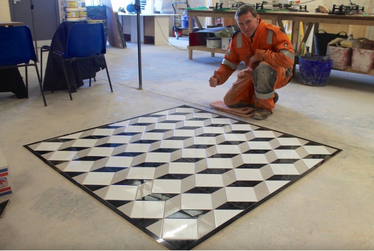
Create a bold statement by opting for contrasting tile and grout colours. Dark tiles with light grout or vice versa can add drama and visual interest to a space. This approach effectively highlights specific areas, such as a backsplash in the kitchen or an accent wall in the bathroom.
Tip: Ensure that the contrasting colours complement rather than clash with the overall colour scheme of the room.
- Neutral Serenity
Neutrals are timeless and versatile. Combine beige or grey tiles with matching grout for a serene and calming atmosphere. This neutral palette is suitable for various design styles, from modern to traditional, and provides a backdrop that allows other design elements to shine.
Tip: Experiment with different tile patterns, such as subway or herringbone, to add visual interest within a neutral colour scheme.
- Earthly Warmth
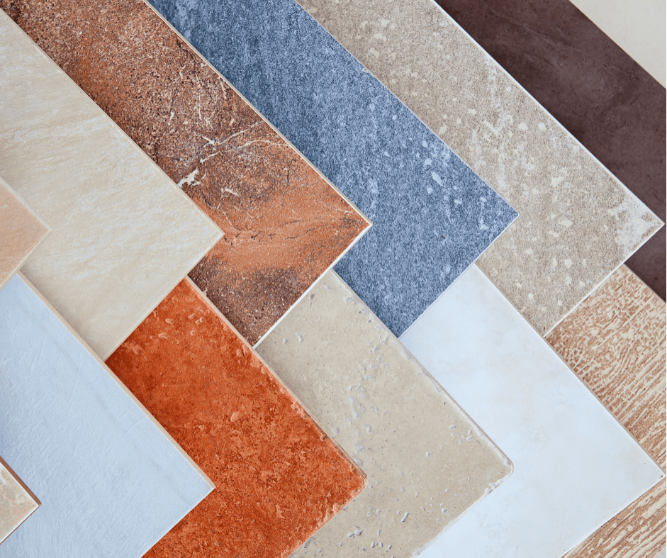
Embrace the warmth of earthy tones by selecting tiles in shades of terracotta, brown, or muted greens. Pair them with a complementary grout colour to enhance the natural and cosy feel. This combination is particularly well-suited for rustic or Mediterranean-inspired interiors.
Tip: Matte-finish tiles with slightly darker grout can accentuate the earthy and natural aesthetic.
- Cool Blues and Greens
For a refreshing and tranquil ambience, consider cool blue or green tiles paired with a matching grout. This combination is ideal for bathrooms or spaces where you want to evoke a sense of calm and relaxation. Lighter grout tones enhance the overall freshness of the colour scheme.
Tip: Incorporate natural elements like plants or wooden accents to complement the cool colour palette.
- Modern Minimalism
Minimalist design often relies on a simple colour palette. Opt for large-format tiles in neutral tones, such as white or light grey, with a grout colour that closely matches the tile. This seamless look creates an illusion of expansiveness and contributes to the overall modern aesthetic.
Tip: Choose rectified tiles for a sleek and uniform appearance, where grout lines are minimal.
- Playful Patterns
If you enjoy a bit of playfulness in your design, experiment with patterned tiles. Whether it’s geometric shapes, encaustic patterns, or vibrant motifs, let the tiles be the focal point. Pair them with a neutral grout that complements the predominant colours in the pattern.
Tip: Reserve bold patterns for specific areas to avoid overwhelming the entire space.
Tile and Grout Maintenance for Long-lasting Beauty
Once you’ve achieved the perfect tile and grout colour combination, maintaining their beauty is essential. Here are some tips for long-lasting vibrancy:
Regular Cleaning
Implement a regular cleaning routine to prevent dirt and grime build-up. Use a pH-neutral cleaner to avoid damaging the tiles or grout.
Grout Sealing
Periodically seal the grout to protect it from stains and moisture. This is especially crucial in high-traffic areas or spaces prone to spills, such as kitchens.
Prompt Stain Removal
Address spills and stains promptly to prevent them from becoming permanent. Different stains may require specific cleaning solutions, so be sure to identify the stain type before applying any remedies.
Avoid Harsh Cleaners
Steer clear of abrasive cleaners that can scratch tiles or erode grout. Stick to mild cleaning solutions and tools to preserve the integrity of your tile and grout surfaces.
Periodic Tile Inspection
Periodically inspect tiles for any signs of damage or wear. Cracked or chipped tiles should be replaced promptly to maintain the overall aesthetic.
Professional Maintenance
In cases where DIY efforts fall short, consider professional tile and grout cleaning services. Professionals have the expertise and tools to deep-clean and rejuvenate your tiled surfaces.
Conclusion: Bringing Your Vision to Life
Selecting the right tile and grout colour combinations is a journey of self-expression and creativity. Whether you opt for timeless neutrals, bold contrasts, or soothing blues, the key is to align your choices with the overall design vision for your space.


